Here at InsideTracker, we listen to what our customers say. Recently we incorporated our customers comments and suggestions into an updated, information-rich Bloodwork page. We are proud to unveil the new, streamlined page which gives an easy-to-read summary of your blood test results, while also allowing you to do a deep dive into analysis and recommendations for understanding and improving your results.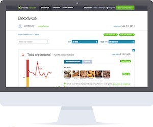
To help you get the most from this new design, let’s tour the page.
Getting your biomarker resultsThe heart of InsideTracker is biomarker analysis. Each biomarker measured in your tests appears on the Bloodwork page in a simple frame. When the page opens, optimized biomarkers display the biomarker name and the latest numerical InsideTracker blood test result. If you want to see more detail, all you have to do is click the upside-down triangle in the top right corner to see an expanded view, as you see for LDL cholesterol below.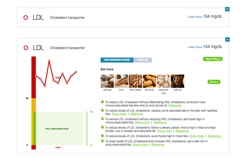
Biomarkers that are not optimized, however, appear first in the expanded view, drawing your attention to the data and the recommendations for simple interventions that can help you to optimize your results.
Click here to see a live demo of the new Bloodwork page.
InsideTracker has always provided information in graph, text, numerical, and image form to make it easier to understand your results. As part of updating the page design, we have also redesigned the biomarker result graphs to make them even easier to read.
Optimal, not just normalThe new graph clearly shows your green optimized zone inside the yellow normal zone. Values outside of the normal range are in the red zones on the graph. Only InsideTracker calculates your personal optimized zone based on your age, sex, gender, ethnicity, activity level, and performance goals. Research has shown that improving biomarkers to optimal levels can yield significant improvements in performance and outcomes, as compared to normal biomarker levels.
The new graph design highlights trends as the color of the data line changes to match the zone color. In the Vitamin D graph below, the latest results are in the optimized zone so the trend line and the data points are green. It’s easy to see the improvement from earlier results in the red and yellow zones. The color changes can quickly alert you to your successes as well as to biomarkers where you may want to step up your efforts.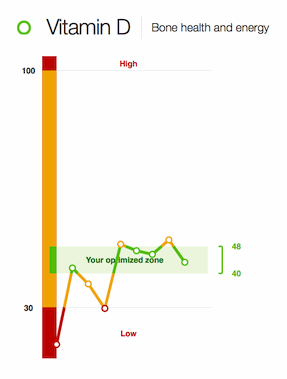
If you want to improve your blood test results, what can you do? Follow the simple recommendations for nutrition, exercise, supplement, and lifestyle changes that appear next to the graph. Food images show you a sampling of healthy foods that you can add to or increase in your diet to help optimize the biomarker. For even more food recommendations, you can click the More button to view the Nutrition page. Below the food images are supplement, lifestyle, exercise and nutrition interventions to help you improve your results. Each recommendation is based on peer-reviewed studies; click the Reference link to read the research abstract. The Show More link provides more detail.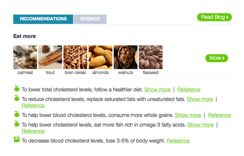
InsideTracker scientists identified key biomarkers from more than 3,000 possibilities. For a brief user-friendly explanation of the biomarker and its role, click the Science tab next to Recommendations. You’ll see a paragraph that explains the function of the biomarker in your body, what happens if the level is low or high, and how your well-being and performance might be affected by changes in that biomarker.
How can I learn more?To get in-depth information that is tailored to your biomarker results, click the Read blog button. InsideTracker’s algorithm links you to the InsideTracker blog post best suited to the level of your biomarker. If your ferritin is low, you will be taken to a blog about the importance of ferritin, some of the symptoms you may experience when your ferritin is low, and advice on how to improve your ferritin level.
How can I zero in on key information?The new Bloodwork page has two great tools to help you focus on the biomarker results and analysis most important to you - Search and Sort. Concerned about your Testosterone result? Just type Testosterone into the Search box. The display jumps directly to Testosterone - no scrolling necessary. The Sort menu allows you to look at biomarkers by category - Optimized, Needs Work (Yellow Zone), At Risk (Red Zone), or Biomarker Groups.
What are Testosterone:Cortisol Ratios?The Ultimate Plan includes two ratios to help you understand your overall testosterone status. The Testosterone:Cortisol ratio and the Free Testosterone:Cortisol ratio are indicators of possible overtraining. Free testosterone is the biologically active testosterone in your body. Cortisol is a hormone that increases as your stress increases and your sleep decreases. A low score on your ratio of Testosterone and Cortisol or Free Teestosterone and Cortisol can show that you are training too hard with overly intense workouts and insufficient time for rest and recovery.
If you haven’t reviewed your Bloodwork page recently, take a look at the new design. And if it has been awhile since your last test, arrange a follow-up InsideTracker test today to see what progress you’ve made!
Try Our Free Demo