How do you feel when you’re waiting for your latest set of InsideTracker results? We like to think of it as a big, shiny gift waiting to be unwrapped. If it’s your first InsideTracker analysis, you’re probably thinking about the here and now: “Where do I stand? Are any of my biomarkers too high, too low?” If it’s your second, or third, or seventh InsideTracker test, you’re probably hoping that your present results have improved since the last one. Of course, everyone who uses InsideTracker is hoping to make changes in the present that will improve their future.
Your present, past and future are all equally important when it comes to health. InsideTracker is looking at your whole journey; at all of you. And a great way to see your body's trip through time is by looking at the biomarker graphs on your Bloodwork page.
We're excited to announce the newest incarnation of biomarker graphs – one that can help predict the future, using trendlines that factor in your past and present results. If you have three or more tests in your InsideTracker profile, you'll now see this new "trendline graph" on your bloodwork page!

Read on to understand the what, how and why behind this new addition...
Predicting the future
By putting your present and past results on one graph, InsideTracker reveals how each of your biomarkers changes over time. That’s great for seeing where you’ve come from, but wouldn’t you like to know where you’re headed? While InsideTracker can’t give you a crystal ball, we’re very excited to announce that we’ve added the next best thing to your bloodwork graph: a trendline.
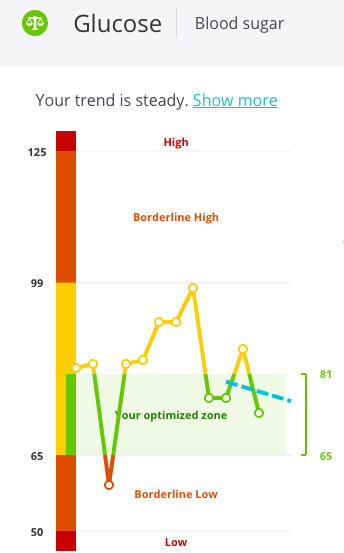
Based on the averages of test results from the past 3 years, your trendline plots the average change in the biomarker and projects what your future results might be if the trend continues. Your trendline is a dashed blue line overlaid on the graph. The only catch is that you need to have at least 3 sets of results within the past three years in order for InsideTracker to build a trendline for your results.
Armed with your trendline, you can think more clearly about the future. Are your results in the normal zone, but moving steadily toward the optimized zone? Great; keep at it! Are your results optimized but trending toward the needs work zone? Time to double down on your diet and exercise plans!
Are you in the zone?
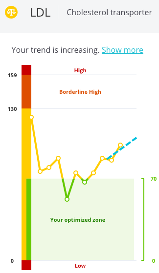
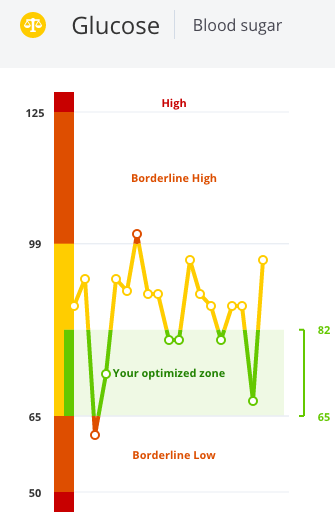
Let's take a moment to break down the zones. Each biomarker graph shows your optimized (green), normal (yellow) and out-of-range (red) zones. Take a look at these on the Ferritin graph below.
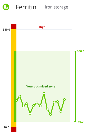
The ferritin example
Ferritin is a biomarker that gives a good indication of the amount of iron that you have stored in your body. The “normal” range for Ferritin for a man is 20-380 ng/mL as shown by the yellow bar on graph. Ferritin measurements below 20 (too low) or above 380 (too high) are outside the normal zone, and these parts of the bar are red.
The normal zone, though, is the same for everyone – from a professional soccer player to a retired couch potato. Fortunately, InsideTracker scientists understand that "normal" is a far cry from "optimal"; that you're unique and your body's optimal zones are different than the next person's. Our scientists have applied years of research and a lot of big data to find the optimal level for you based on your age, gender, ethnicity, activity levels, behavior and goals.
Take a look at the optimized zone marked in green on the graph, above. In this example, the optimized zone for Ferritin for an active 45-year-old male is between 40-300 ng/mL.
If your results are in the green zone, they are “optimized”, at the best level for you personally. Results in yellow zone are normal, but not optimized – so InsideTracker will tell you that they “need work”. And results in the red zone are “at risk”, because they are outside of the normal zone.
For some biomarkers, there are special transition zones, such as the orange zone –"borderline high" – for glucose. Fasting glucose results between 100-125 deserve extra attention.
What are your numbers?
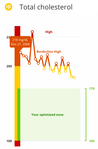
The dots on the graph represent your blood test measurements. You can roll over each dot to see the exact result and the date. The dot farthest to the right is your most recent result, the one farthest to the left is the oldest. For example, the graph below shows that over 8 years, this user has improved his cholesterol from the borderline high zone to the normal zone – but not yet optimized.
Have three or more tests under your belt?
...we encourage you to log in to your InsideTracker profile and check out the bloodwork page to see where your body is headed. Ultimately, our new, predictive graph shows your past, present and potential future – all in one place! It's no DeLorean, but we think it's pretty darn cool.
Wondering what ALL of your biomarkers mean? We've created this handy biomarker e-book for reference—it's FREE & it's yours to download!

Some other blog posts we think you'll love:
- Tired of Being Tired: How I Optimized My Iron Levels
- Getting Back on Track: Laura Ingalls' InsideTracker-Fueled Journey Back to Holistic Health
- Avoiding The Crash: How Monitoring Iron Levels Can Save Your Season
- Stress Fractures: The Relationship Between Biochemistry, Nutritional Screening and Biomechanics